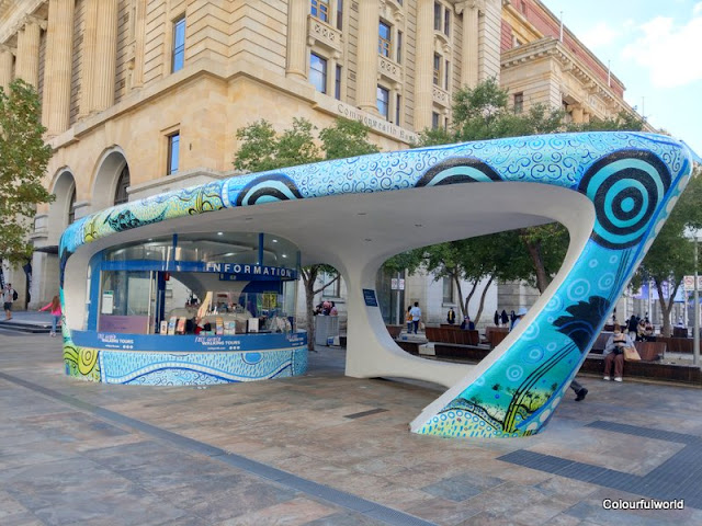
When I went to the city at the start of May, the Perth City Visitor Kiosk in Forrest Square, had changed its "skin", and was now sporting Aboriginal art painted by Perth Noongar artist Nerolie Bynder.
In October 2020, I had photographed the kiosk covered in rainbow colours for the Perth Spring Festival.
They are both quite striking aren't they?
I love murals and street art. If you like murals or have a mural you'd like to post, this meme is for you. Just follow the Linky steps below. Once you start looking you will find murals everywhere. The "Monday Mural" meme goes live on Monday at 12,01AM, Perth,Western Australian time. Be sure to link back to this blog and visit your fellow posters. Looking forward to your mural finds this week. Thanks, Sami.


I especially LOVE the aboriginal art. It is primitive and very beautiful. Thanks for sharing this, Sami.
ReplyDeleteThanks Elizabeth, glad you enjoyed the aboriginal art.
Delete...both are a BIG WOW, but the new version is my favorite. Thanks Sami for hosting the party.
ReplyDeleteThank you Tom :)
DeleteThe aboriginal art is really beautiful and more appealing than the previous one.
ReplyDeletebest… mae at maefood.blogspot.com
Thanks Mae :)
DeleteI like the shape and design of this building whose architecture evokes the future as it was dreamed of in the 1950s. The paintings are enchanting. The drawings are very beautiful, especially those inspired by Aboriginal paintings.
ReplyDeleteThanks Arnaud, I quite like the shape of the building too.
DeleteLove indigenous art, I'd like to see more.
ReplyDeleteI'll be on the lookout for other Aboriginal murals, thanks Amy
DeleteBeautiful, and I do like the look of the building.
ReplyDeleteThanks William. It is a nice shape :)
DeleteI think it looks so much better with its current decoration. There's lots of interest to examine.
ReplyDeleteThanks Andrew, with either "cover" it looks better than when it was just plain white.
DeleteOh wow! This is cool and colourful. And and it's great that it reflects aboriginal art :)
ReplyDeleteThe shape of the structure is also so cool.
Thanks Dee :)
DeleteDearest Sami,
ReplyDeleteThe top version, the new one, is FAR better and blends in far better.
Those screaming colors were not pleasant to look at... and not blending in well with the environment.
Hugs,
Mariette
Thanks Mariette, I quite like the Aboriginal art one, the other one was just for Spring.
DeleteWow, they are both so very beautiful. Love them all.
ReplyDeleteThanks for sharing and I hope that you have a wonderful week.
Thanks Patrick, have a great week too.
DeleteTruly Amazing works.
ReplyDeleteAwesome clicks.
Have a nice week ahead.
Thanks Rupam, have a great week too.
DeleteBoth designs are striking. But love the Aboriginal art for its colour and history.
ReplyDeleteThanks Teresa, it is quite striking.
DeleteThey´re all so pretty!!! I only know this as plain white. Haven´t visited you for real in a long time, obviously.
ReplyDeleteThank you for sharing, really. And hosting, of course!
You made Ingo go eagerly for a walk to show me a new one (it was but a graffiti, but he gives his best).
For a long time it was just plain white, but they might have thought it was a perfect canvas for new murals once in a while. Thanks Iris
DeleteWish we had this in France!
ReplyDeleteThanks Rob 🤗.
DeleteMuito interessante estas estruturas.
ReplyDeleteUm abraço e boa semana.
Andarilhar
Dedais de Francisco e Idalisa
O prazer dos livros
Obrigada Francisco. Boa semana
DeleteIt all looks very colorful. Only the design of the stand is totally not made for these artistic paintings and there it wrinkles a little. I would say reflect before you begin.
ReplyDeleteThanks SC. I'm sure it's not easy to wrap the mural around the building.
DeleteThey are both pretty but I like the one in your first photos the best.
ReplyDeleteThanks Sharon, 😁
DeleteWonderful stuff. I'd be inclined to walk back for a second look!
ReplyDeleteIt does deserve a few looks, thanks David 😁
DeleteLoved them both.
ReplyDeleteThanks Jackie 😀
DeleteLove the new painting on the Visitor's Center. The art is terrific and well documented in your photos.
ReplyDeleteThanks so much 😀
DeleteThe new painting is wonderful!
ReplyDeleteThanks Pat 😊
DeleteIt makes me smile!
ReplyDeleteThanks, glad you liked them.
DeleteI love the animals, and the motifs, Sami
ReplyDeleteThanks Cloudia.
DeleteIt really is the perfect canvas for artwork don't you think Sami, and it is a tourist information Centre, they certainly can't be missed here 😉
ReplyDeleteDifficult to miss such bright art and interesting building. Thanks Grace.
DeleteI love the architecture of those kiosks!
ReplyDeleteVery futurist 😊 thanks Klara
DeleteAté dá vontade de pedir umas informações.
ReplyDeleteBoa semana
Realmente é bastante convidativo. Boa semana Pedro.
DeleteOh, I love the animal motifs!
ReplyDeleteThanks Linda 😊
DeleteThose are spectacular! What a wonderful welcome!
ReplyDeleteThanks Jeanie :)
DeleteBoth skins are striking! So different in vibe - it changes the whole look of the booth!
ReplyDeleteIt does look quite different with the 2 skins. Thanks Grace :)
DeleteI think both are good.
ReplyDeleteThanks for sharing your photographs.
All the best Jan