I love murals and street art. If you like murals or have a mural you'd like to post, this meme is for you. Just follow the Linky steps below. Once you start looking you will find murals everywhere. The "Monday Mural" meme goes live on Monday at 12,01AM, Perth,Western Australian time. Be sure to link back to this blog and visit your fellow posters. Looking forward to your mural finds this week. Thanks, Sami.
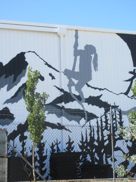
A mural found in an unexpected place - an industrial area in the suburb of Cockburn, on Pusey Road. Painted by Rachelle Dusting in 2020 on the facade of "Chasing Better" - a crossfit health club.
She was also the artist that painted this mural that I showed in November 2019.
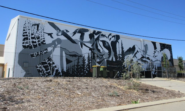
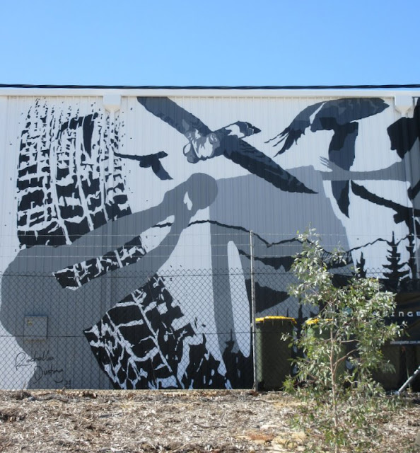
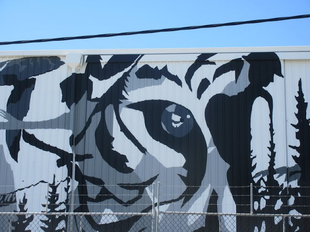
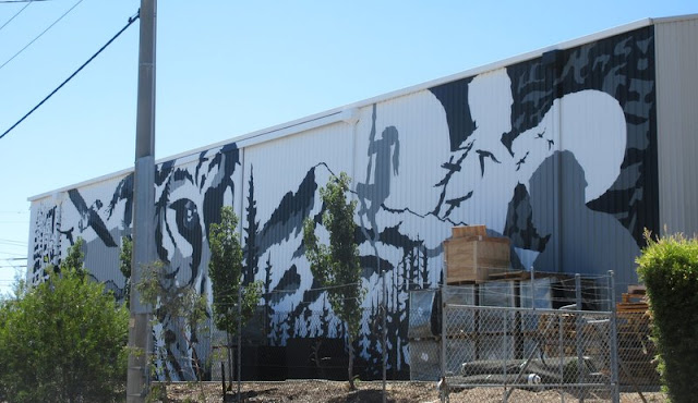
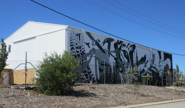
Your mural has a dramatic sense of motion about it. I like the choice of gray, black, white. Thanks once again for hosting this.
ReplyDeletebest... mae at maefood.blogspot.com
Thanks Mae, it suits the gym building.
Delete...it sure is bold graphic in black, gray and white! Thanks Sami for hosting.
ReplyDeleteThank you Tom :)
DeleteThe art you show us is of a very high level! Nice to see you, Sami
ReplyDeleteThanks Cloudia, glad you liked it.
DeleteHow impressive and goes well with the health center, too. I like the colors she chose. The grey humans really popped. Thanks for sharing and hosting.
ReplyDeleteThank you Elizabeth :)
DeleteThis does look like i belongs on a health club. Very fitting.
ReplyDeleteThank you Jeanie, it does go well with the business
DeleteThere is a lot of activity going on in this mural. I especially like the girl on the rope.
ReplyDeleteSome of the things are difficult to fathom. I like the girl on the rope too :)
DeleteIt has a sporty feeling about it and definitely suits the building.
ReplyDeleteThanks Amy, certainly suitable for the busines.
DeleteIt is a clever use of just black and white and both mixed.
ReplyDeleteIt's a good contrast, thanks Andrew :)
DeleteVery well done.
ReplyDeleteThanks William.
DeleteAn interesting, a bit scary one...
ReplyDeleteThanks Iris :)
DeleteUma publicidade bem imaginada.
ReplyDeleteBoa semana
Obrigada Pedro, boa semana.
DeleteEye catching mural on a plain white wall of the building.
ReplyDeleteThanks Nancy :)
DeleteAmazing murals, Beautiful photos.
ReplyDeleteThanks Rupam :)
DeleteGostei deste mural.
ReplyDeleteUm abraço e boa semana.
Andarilhar
Dedais de Francisco e Idalisa
O prazer dos livros
Obrigada Francisco, o seu comentario foi parar ao spam
DeleteVery nice murals!
ReplyDeleteThanks Marianne :)
DeleteWonderful mural. The creative spirit in this one stands out.
ReplyDeleteThanks David :)
DeleteI like the monochrome look to it.
ReplyDeleteThank you Jackie :)
DeleteI admire that mural because it can be more difficult to work in a monochrome pallet. Lots of action in that mural!
ReplyDeleteThanks Siobhan :)
DeleteNice mural.
ReplyDeleteThank you :)
DeleteThe black, gray and white are effective. Sometimes the absence of colors captures my eye more.
ReplyDeleteThank you Susan.
DeleteI like it!
ReplyDeleteThanks Linda.
DeleteI think my previous message didn't appear. But I just wanted to confirm how much I find this fresco very successful, and its author extremely talented. I love the variety of her inspiration.
ReplyDeleteThank you Kwarkito. I'm find a few messages of regular readers going to spam.
DeleteUm belo mural.
ReplyDeleteGostei.
Um abraço e boa semana.
Andarilhar
Dedais de Francisco e Idalisa
O prazer dos livros
Obrigada Francisco, continuacao de boa semana.
Delete